By Allie.
20 26
About Me
Design found me early. Growing up in Colombia, art was always part of how my family moved through the world. By the time I was old enough to choose a direction, it didn't feel like a choice — it felt like the only language that made sense.
I specialize in brand identity and visual systems. I've built brands from scratch, led full rebrands, and executed campaigns for clients including McDonald's and the Alzheimer's Association. My background is broad by design — identity, social, print, product, guidelines — because great brand design has to work everywhere, not just in one place.
I integrate AI tools into my creative process — not to replace the thinking, but to move faster and push the work further.
I'm looking for a team where the bar is high, the work is real, and there's room to grow.
Logofolio
Case Study
Corporate enough to build trust. Young enough to speak to Gen Z. Flexible enough to live across digital, print, and live events.
The Process: The founders came in with two colors they believed in — yellow and black. I honored that and pushed it further, introducing tones of yellow for range and balancing it against black and grey for structure. Anything that could have belonged to a different company got cut. Generic doesn't survive the process.
The Turning Point: When it stopped looking like a logo and started looking like their logo. We tested it across social graphics and presentation decks. It held up everywhere.
Why It Works: The founders saw themselves in it. When that happens, the work is doing exactly what it's supposed to.
Branding Design
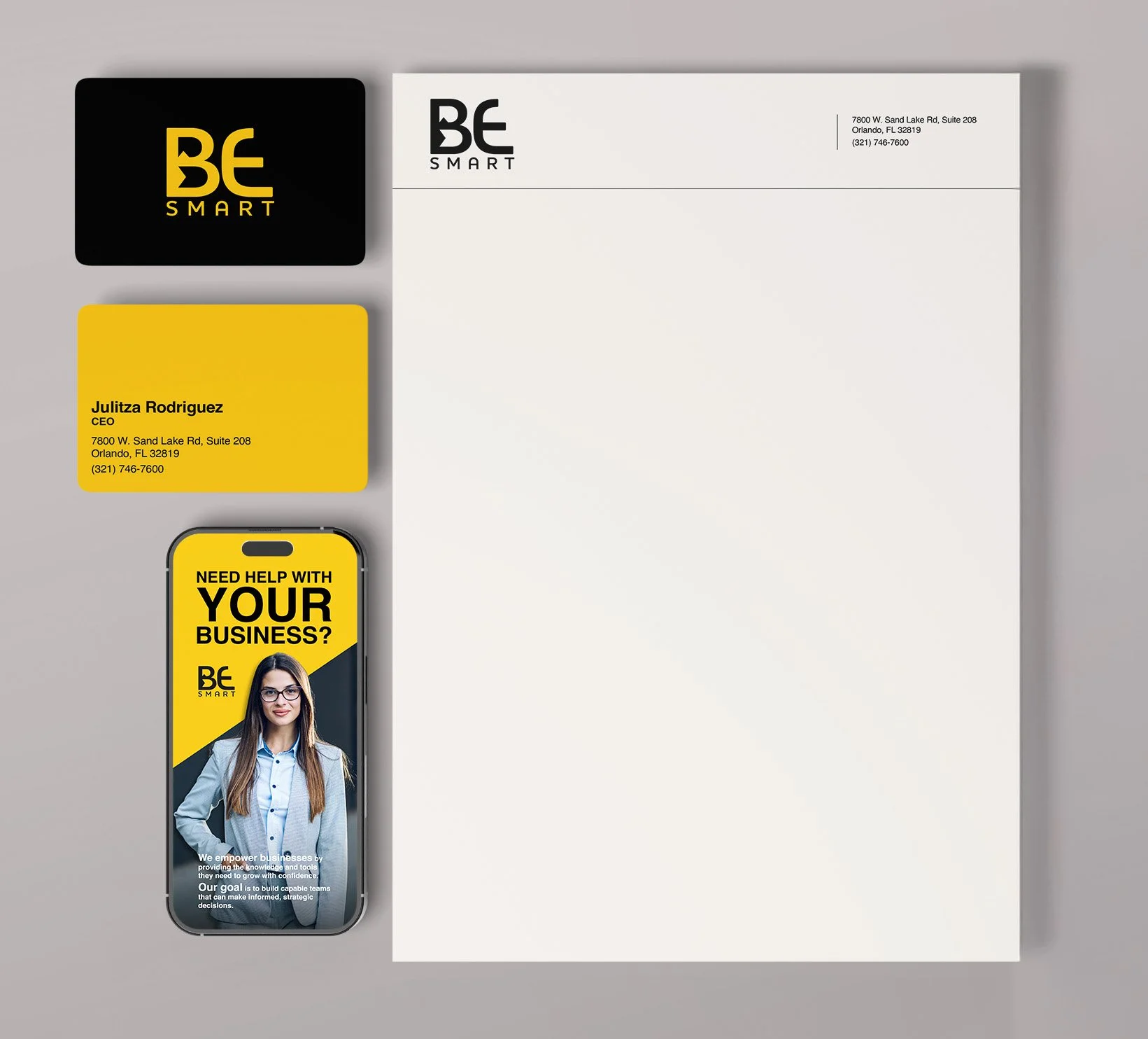
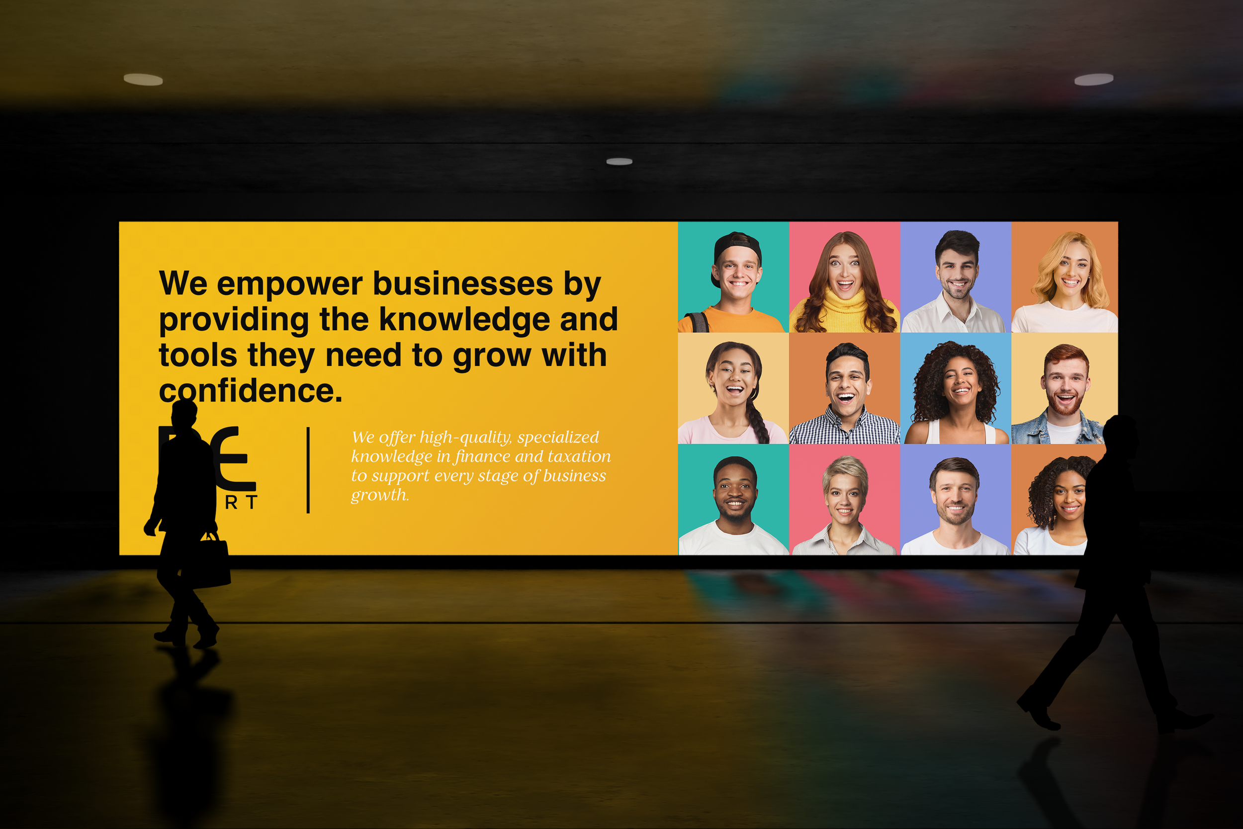
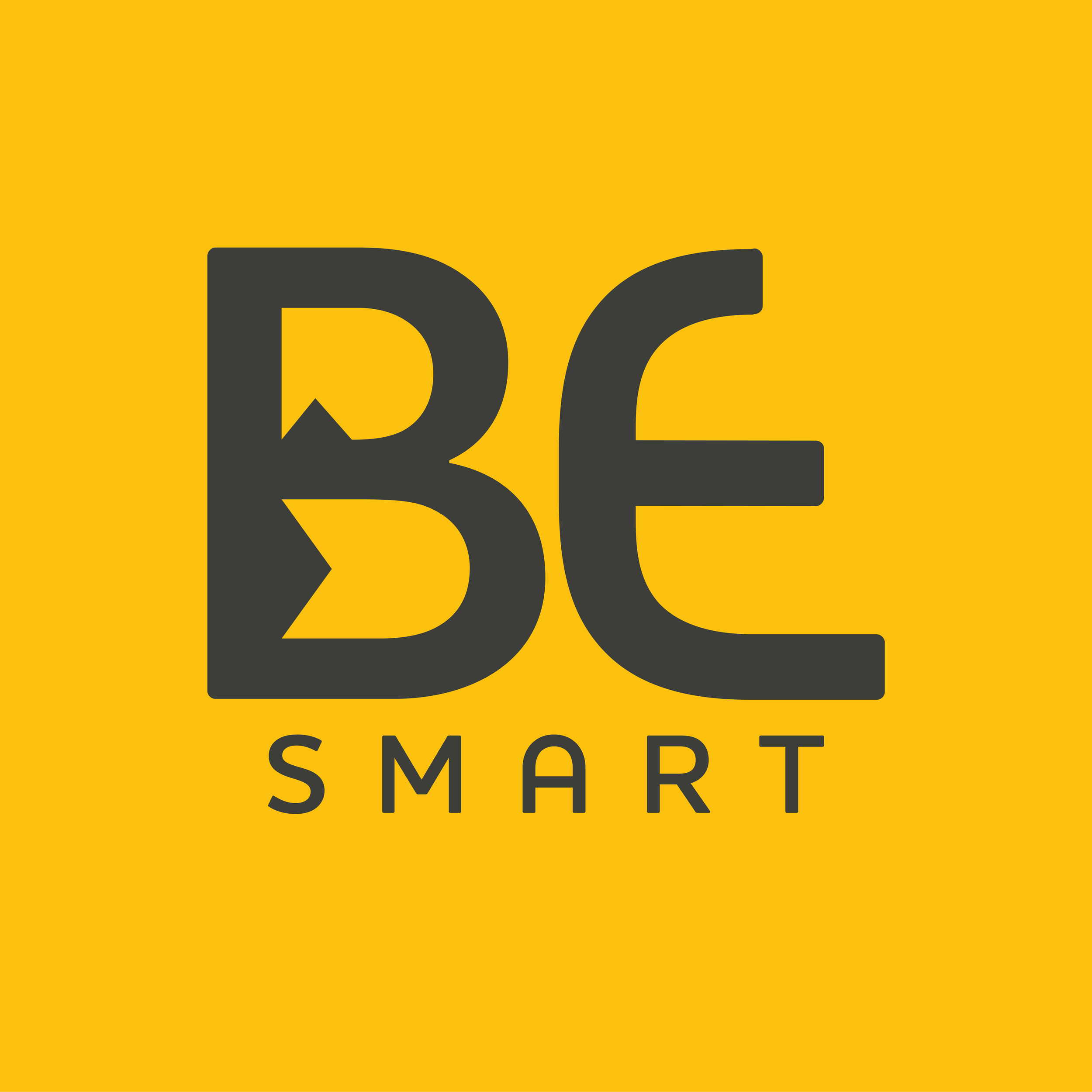
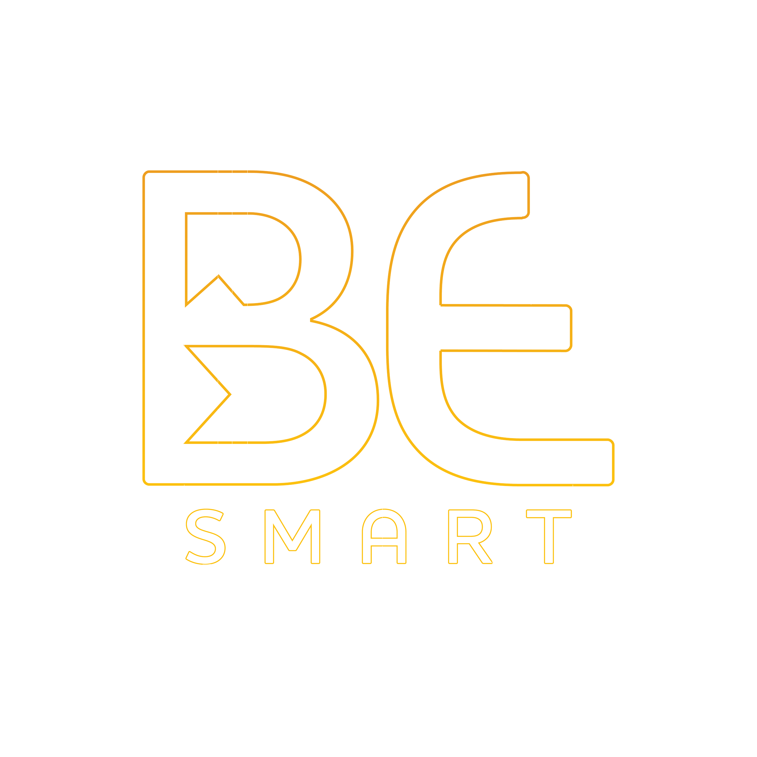
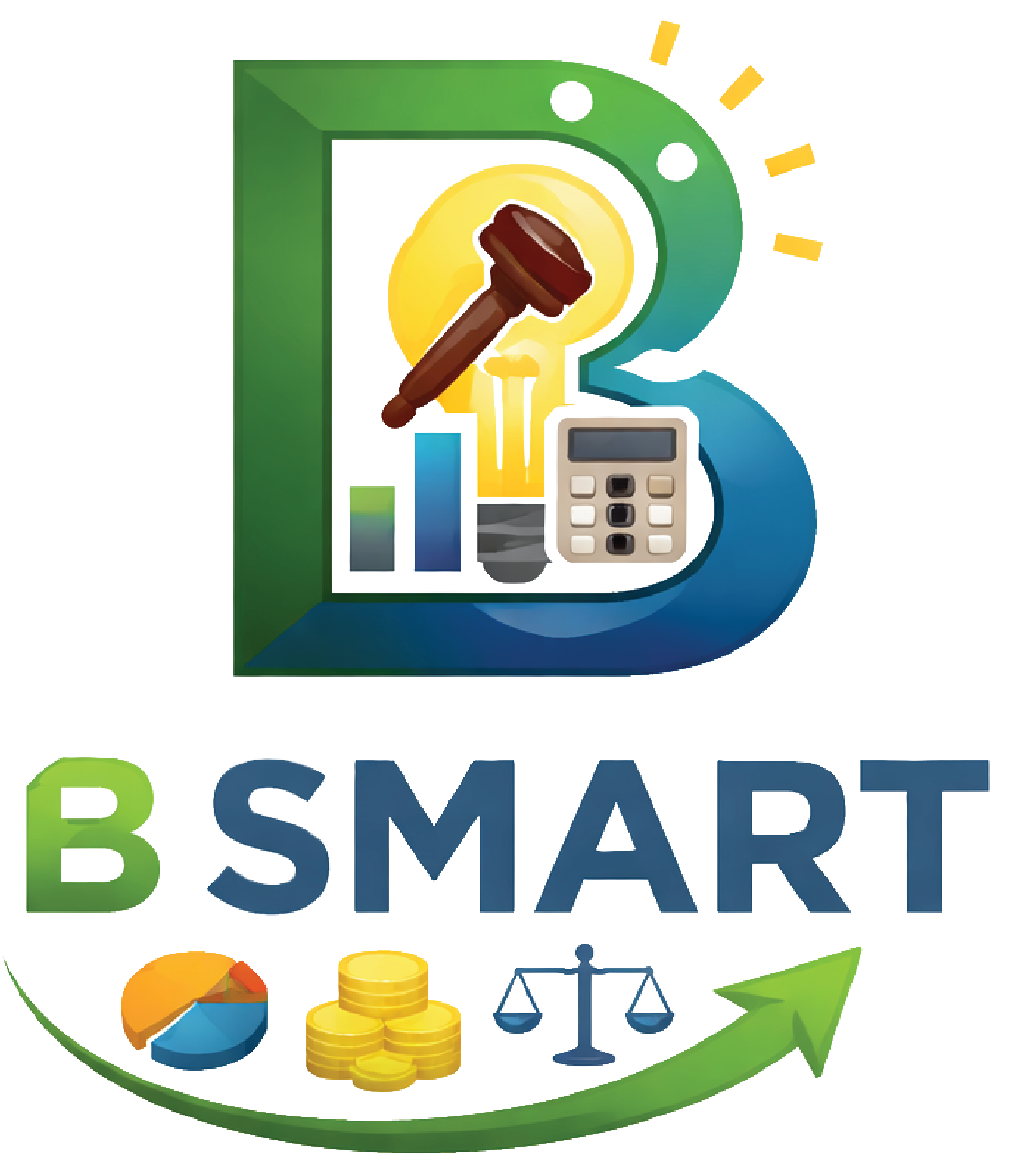
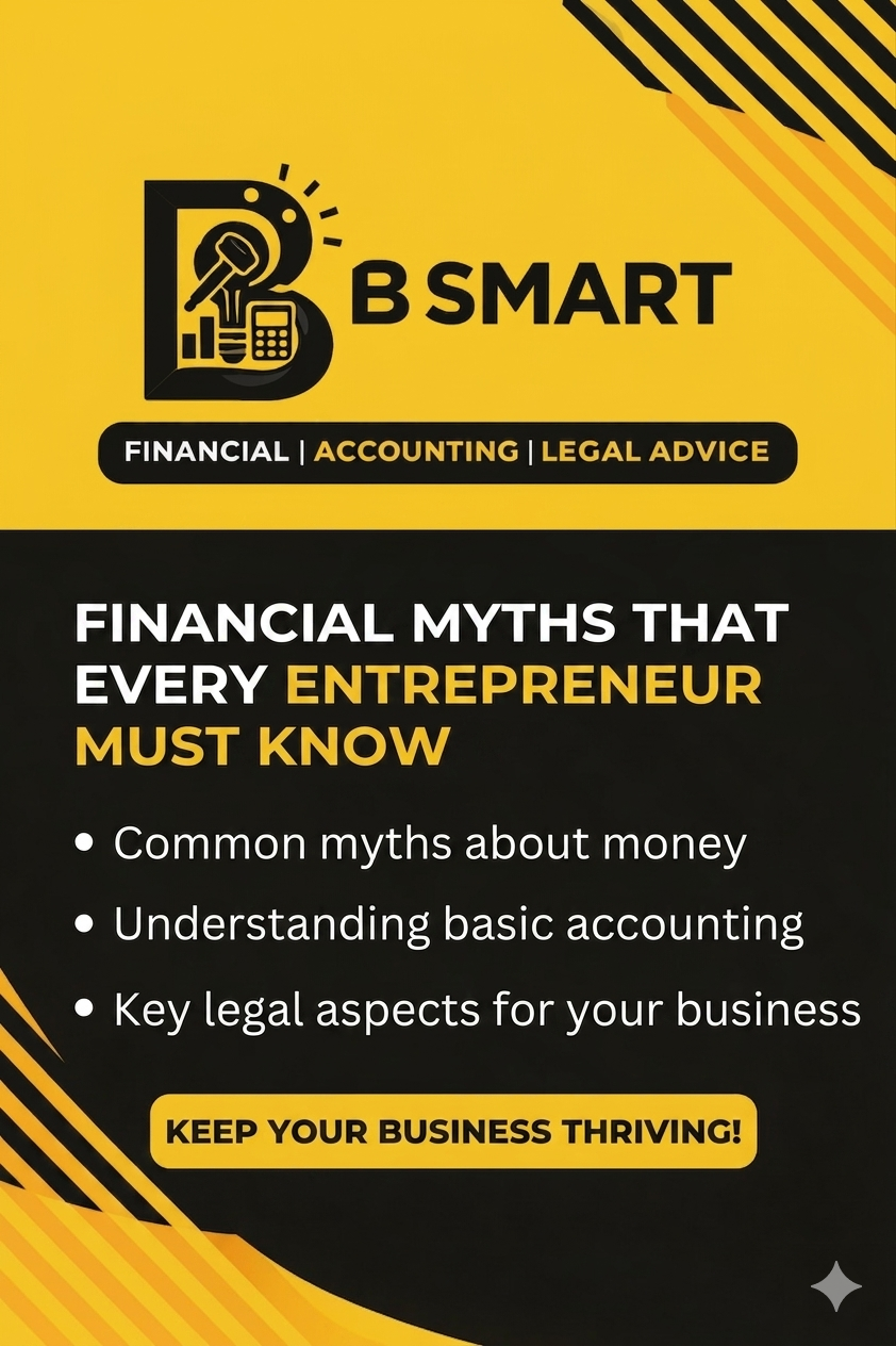
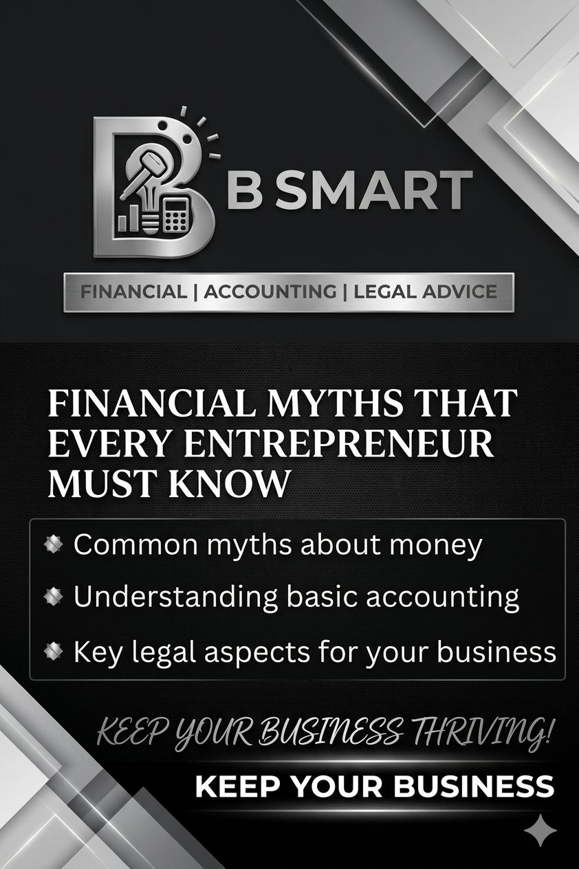
BE SMART REBRAND
BE Smart is a business services company built for Gen Z entrepreneurs. When they came to me, they didn't just need a new logo — they needed a system.
The Problem: No defined color palette. Assets that didn't share a visual language. A brand that felt different everywhere it appeared. It wasn't broken — it was just never properly built.
The Approach: Before opening a design file, I spoke with the founders. Understanding their mission and their audience became the brief. You can't build a brand that connects if you don't know who it's connecting with.
What Was Built: Logotype, color palette, logo lockups, graphic style, merch, print materials, and full brand guidelines — everything rebuilt from the ground up.
The Result: For the first time, everything felt like it belonged together. The founders saw themselves in it. That's when you know the system worked.
BEFORE THE REBRAND
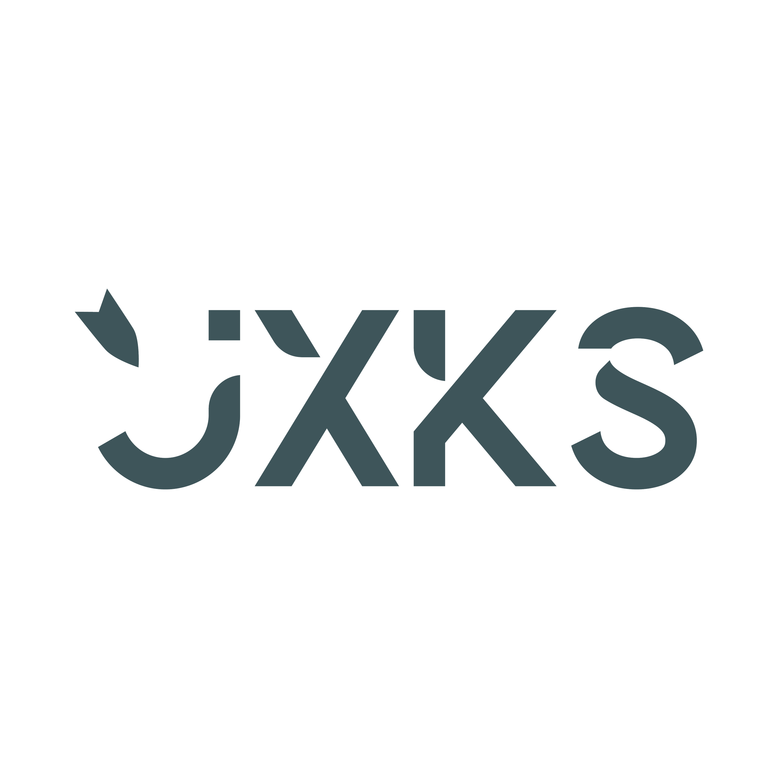
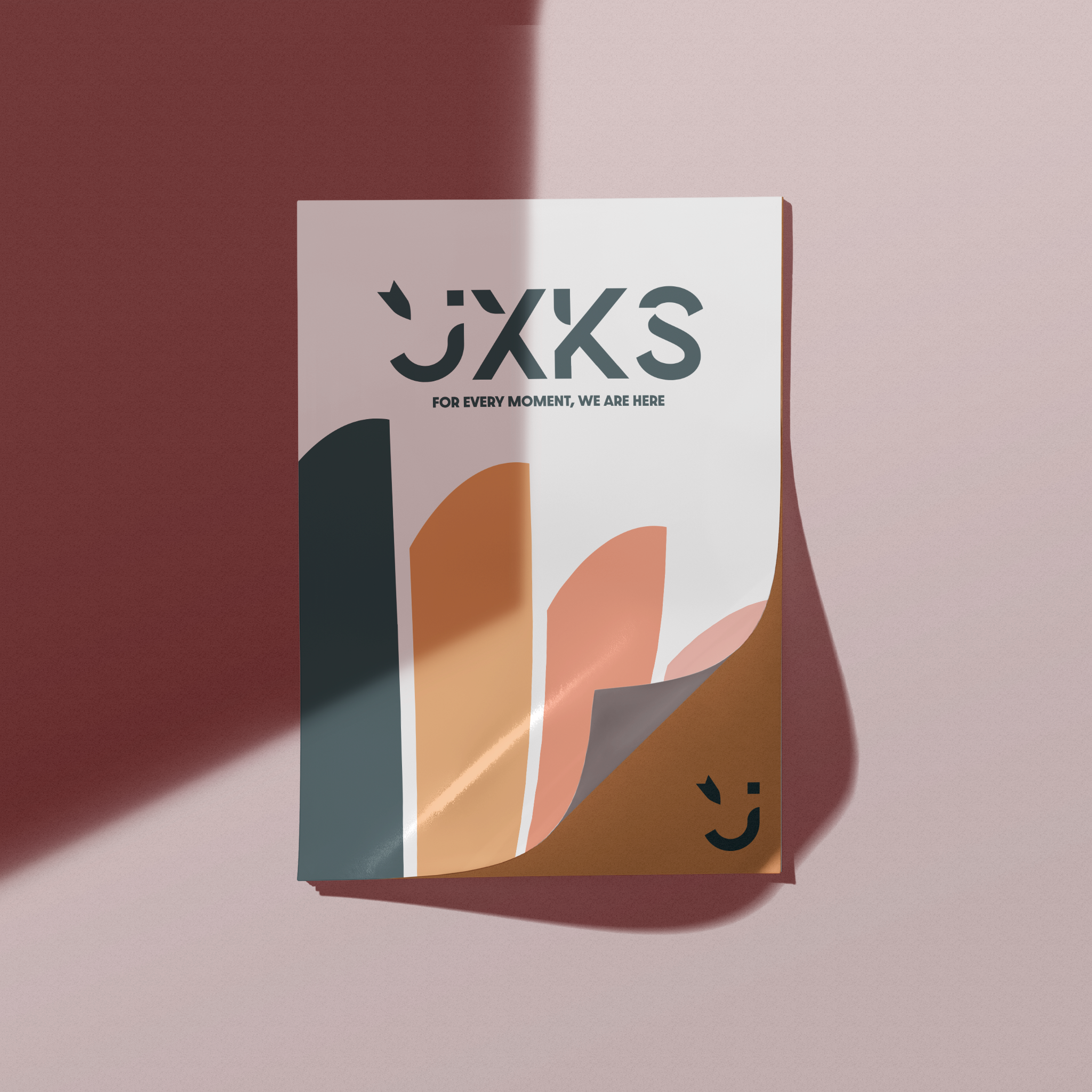
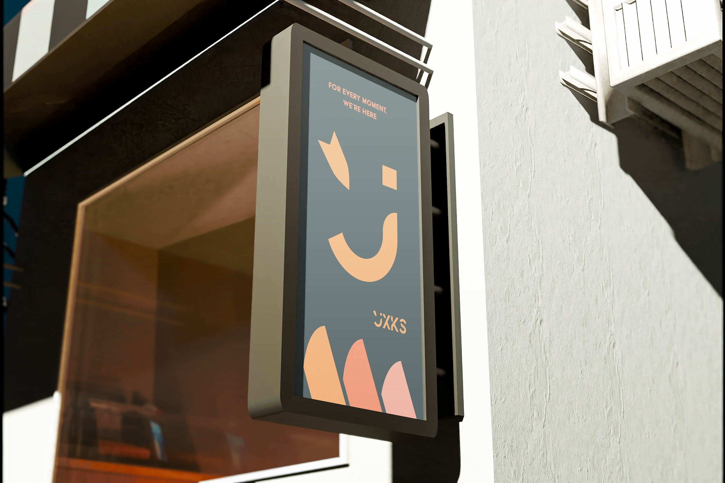
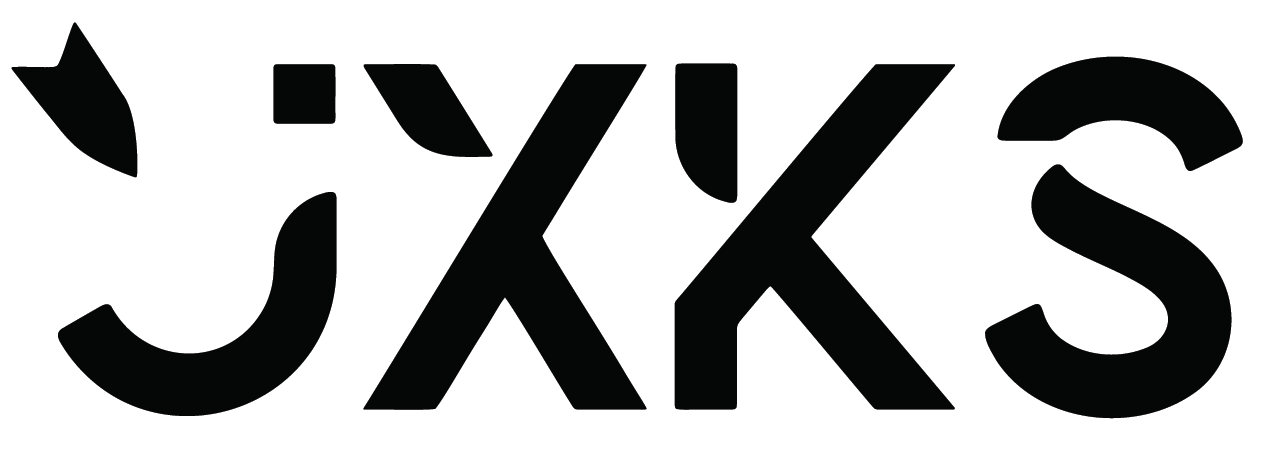
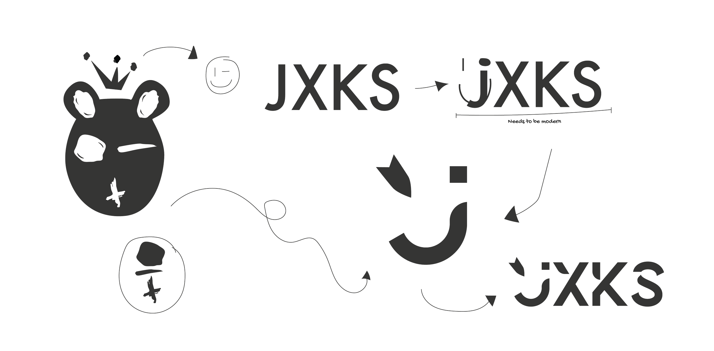
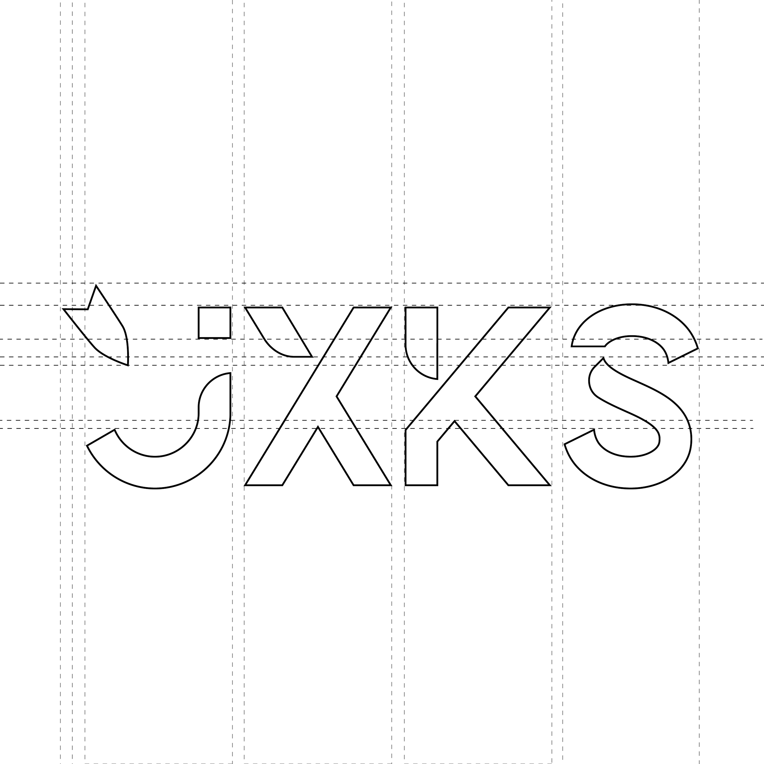
JXKS BRAND
JXKS is a stationery brand I founded, designed, and launched end to end. Every element — logo, color palette, brand guidelines, and physical products — was built to stay consistent as the brand grows.
The Challenge: Balancing approachability with professionalism. JXKS needed to connect emotionally while remaining credible in a professional context. The final identity holds both.
What Was Delivered: Full brand system — logo, brand guidelines, and physical products currently in use. The guidelines aren't just documentation. They're the infrastructure that keeps everything consistent at scale.
The Takeaway: Building JXKS taught me what it actually takes to maintain a brand over time — not just launch it. Consistency doesn't happen by accident. It happens because the system was built right from the start.
LOGO CONCEPT
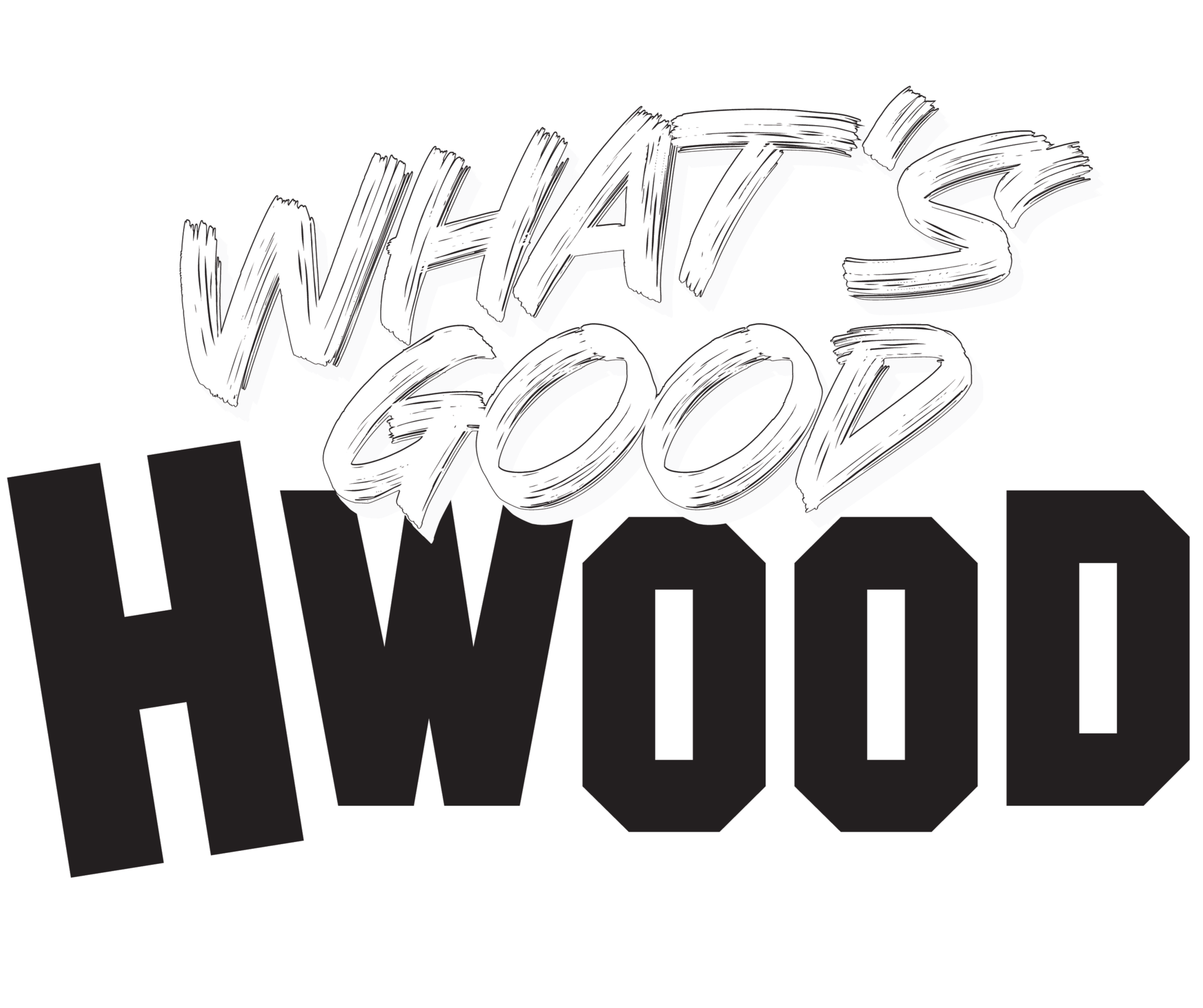
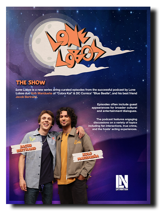
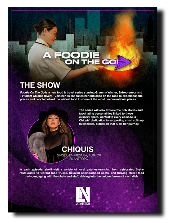
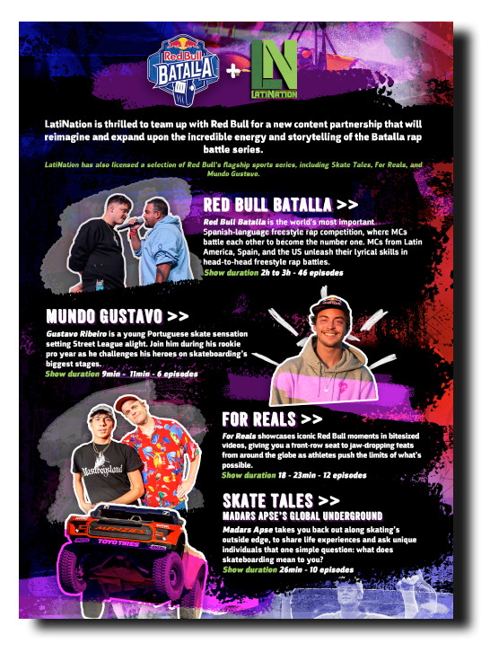
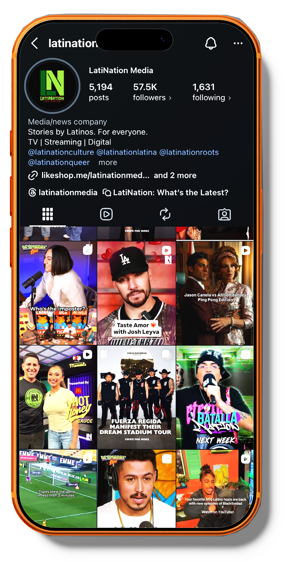
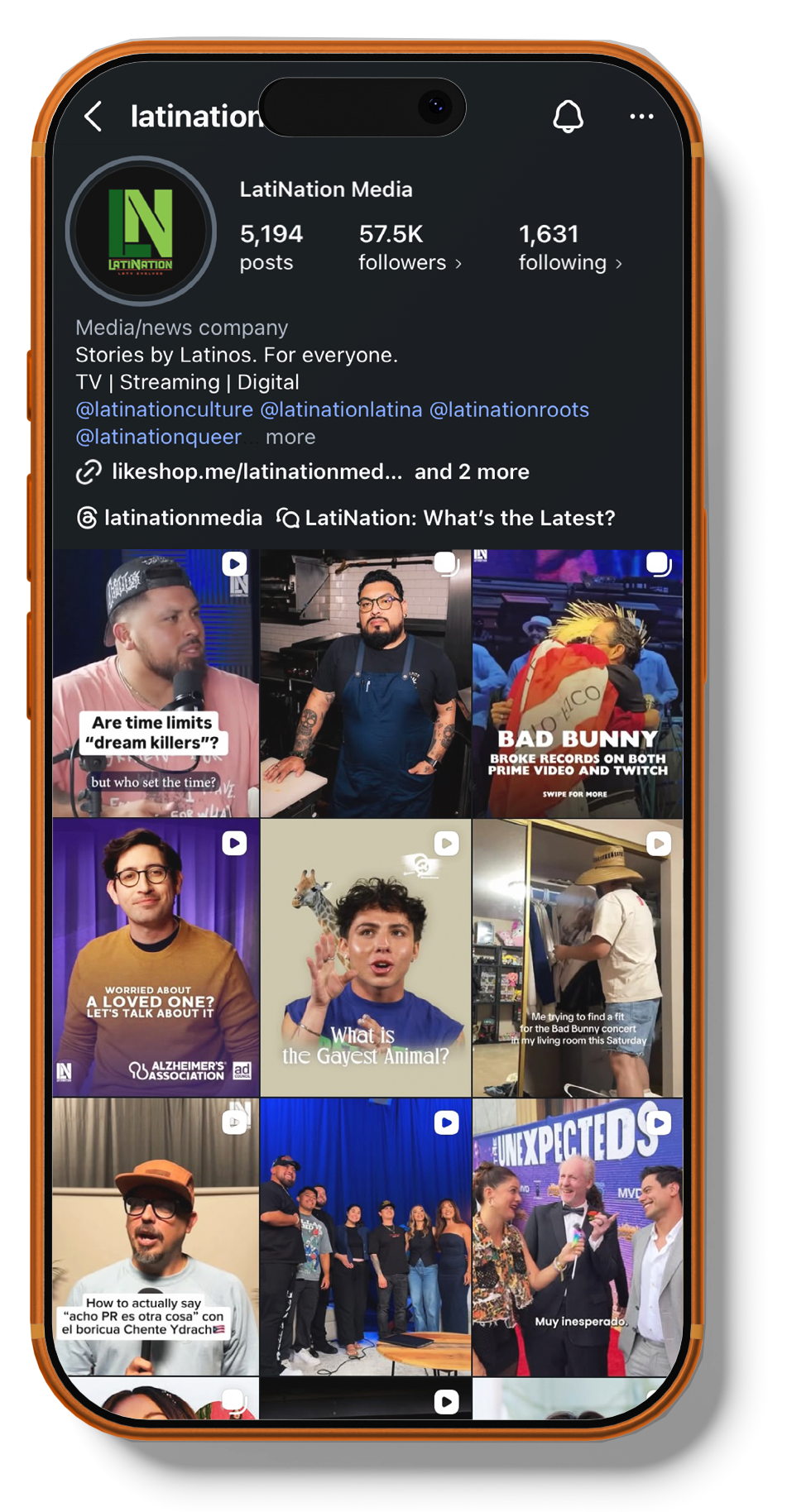
LatiNation
LatiNation is a media and entertainment company producing TV shows and content for Latino audiences. As part of their in-house creative work, I designed one sheets used by the sales department and at company events — collateral that needed to represent the shows professionally and move fast in a real business context.
Print collateral for media and entertainment has to communicate quickly, look polished at any size, and stay completely on brand. That's exactly the standard these were built to meet.
Print Media
Social Media Campaigns
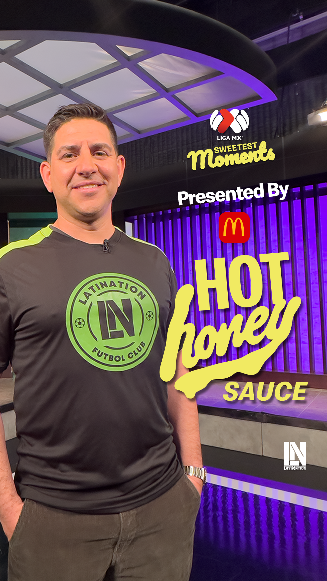
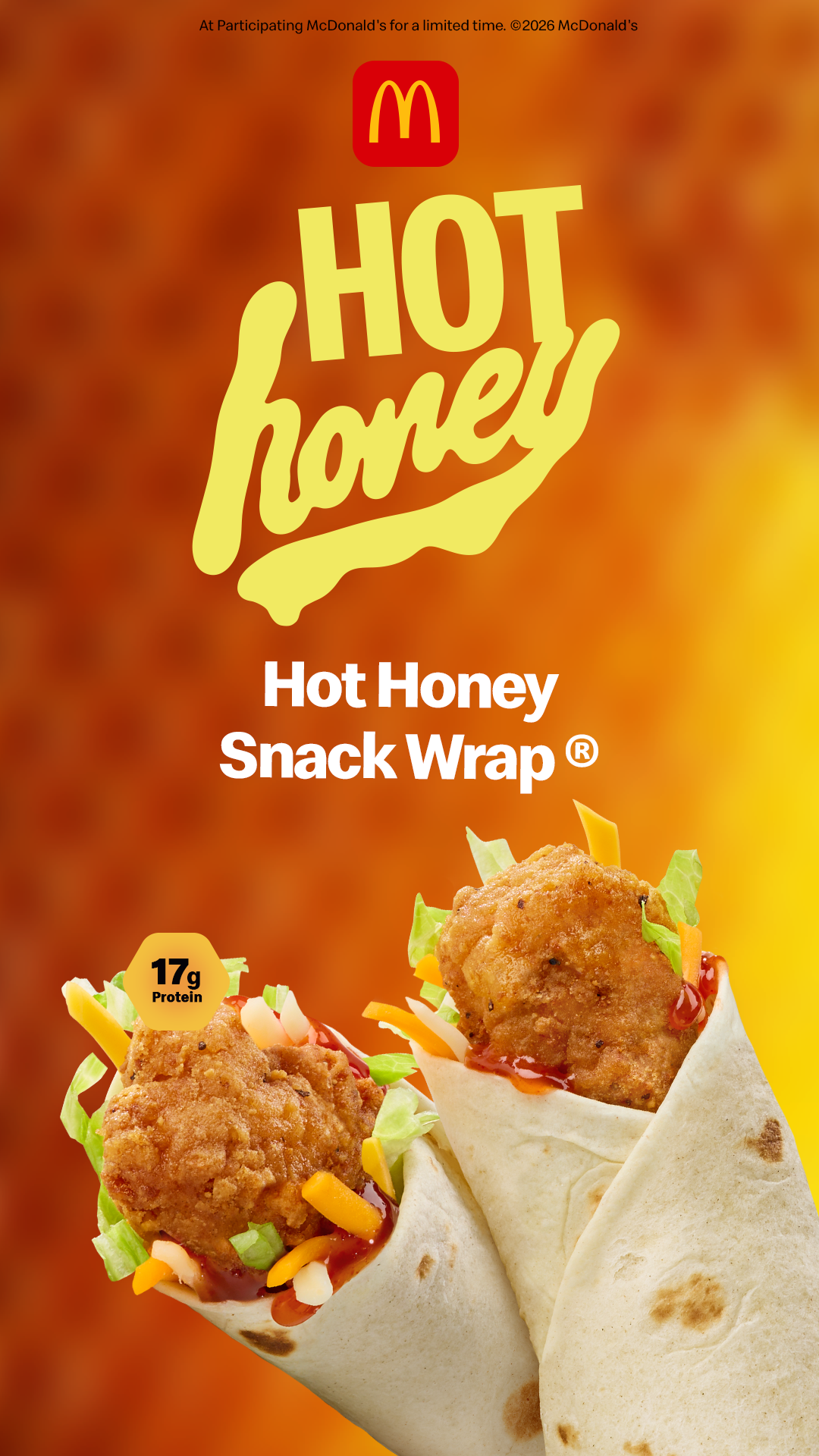
Mc Donald’s
A sponsored collaboration between McDonald's and Liga MX tied to their new honey sauce launch. The campaign needed to live authentically in two worlds — soccer culture and a product launch — without one overshadowing the other.
We kept the energy of the games at the center while integrating the product naturally. Typographic treatments echoed the Liga MX visual language so every asset felt like an extension of the brand, not something applied on top of it.
Working within McDonald's brand standards means every deliverable has to meet their requirements across alignment, tone, and execution simultaneously.
Platforms: Broadcasting · Latination App · TikTok · Instagram · YouTube
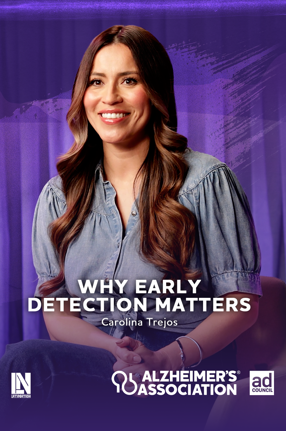
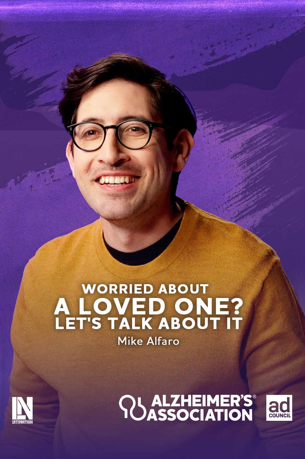
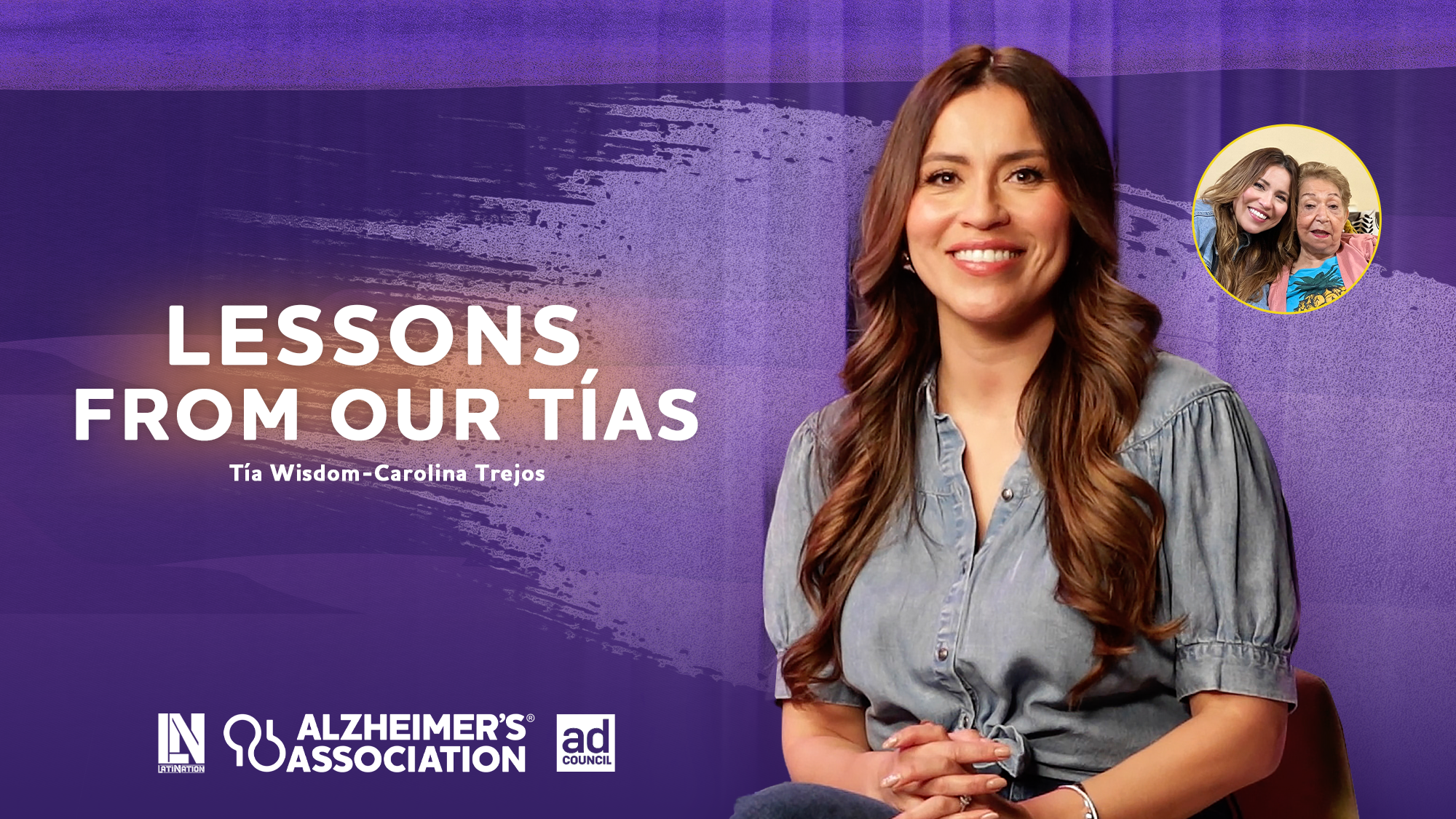
Alzheimer’s Association
A campaign targeting Millennials and Gen Z — younger family members navigating Alzheimer's alongside parents and grandparents.
Working with an established organization means the brand isn't yours to reinvent — it's yours to execute faithfully. I followed the Association's guidelines precisely across color, lockups, tone, and placement. Knowing when to push creatively and when to execute within a system is the difference between good brand design and great brand design.
Platforms: Broadcasting · Latination App · TikTok · Instagram · YouTube